The Goal
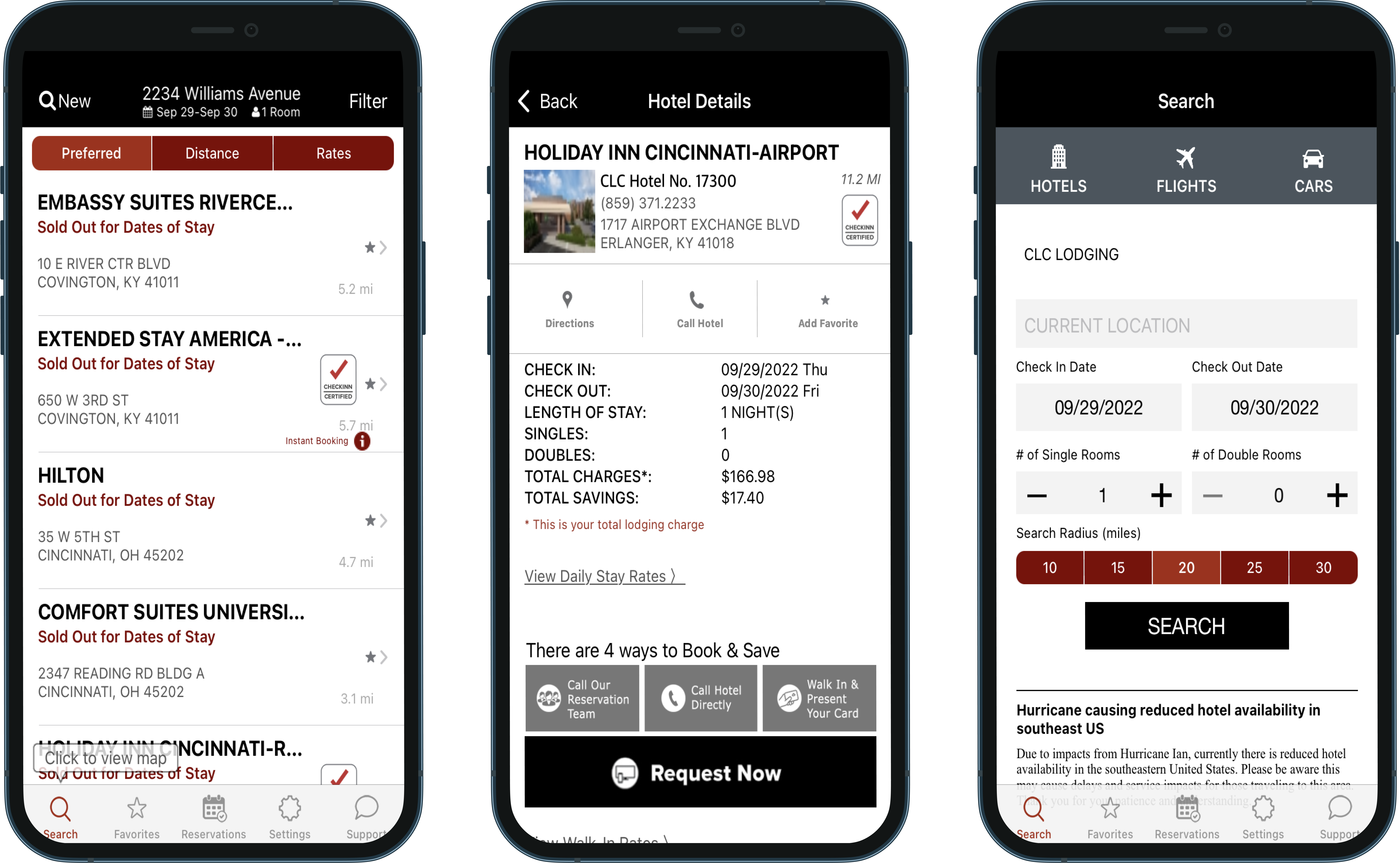
Improve Ratings. CLC approached us asking if we could help improve their ratings. They knew that the app was pretty outdated visually and knew from reviews of some of the things that weren’t working, but needed some help pinpointing and prioritizing enhancements.
To help them achieve this, I wanted to conduct stakeholder interviews as well as perform a heuristic analysis on their current app.
After gathering what information and direction I could from those exercises I would create some concept mockups for some of their main flows.
With these changes, I hoped to achieve a more thoughtful UI with an enhanced user experience for their userbase so that they would be able to easily book lodging while on the road and CLC would see an improvement to their ratings.

Interview
Talking with product ownership. There was one main product owner for the CLC Lodging apps and was one of my favorite product owners to have worked with. She knew the product inside and out and was able to clearly walk me through the app and it’s nuances. Turns out there were a lot of “you can only see this page if...” scenarios.
I also met with other product team members who were able to aggregate user reviews across different platforms. From this I was able to understand user pain points.
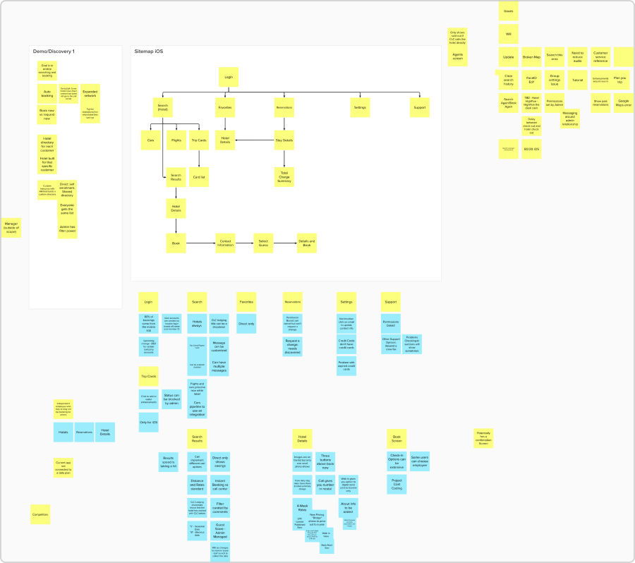
With these conversations happening, I wanted to gather my thoughts, as well as help facilitate thoughts of my product owner, inside a Mural board.
This is one of my preferred methods of quickly capturing notes and ideas from my interviews.

Research
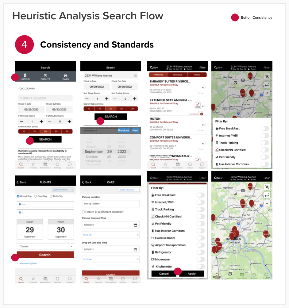
Jakob Nielson. For the analysis I first grabbed Nielson’s 10 Usability Heuristics as a reference. Using this foundation I started breaking out the the app by it’s different flows and screens. I identified the major flow: Login, Search, Hotel Details, and Booking. Alongside this flow were a multitude of one off screens that performed various status or administrative features for the user.
From there I decided to break the flow into the four different micro flows and perform the analysis on each. I gave each screen in the flow a status; Good, Poor, Fail. If the screen didn’t pass a particular heuristic I marked and explained why.
After doing this for the entirety of the app I created a PowerPoint presentation to show to the client.
Findings. Overall the app was mostly in need of a fresh UI with more consistency between component usage. Some key issues of note were it was pretty poor at letting the user know what the error was, leading to frustrations. These frustrations were clearly shown in the apps reviews. Additionally, there were components that looked like they were a button for example, and yet it acted as a tab. However there were other UI versions of tabs making the interaction confusing.

Concept Mockups
Competitor Analysis. I decided since I didn’t have access to any users, I would have to rely more on my experience and the designs of other competitor apps. I downloaded and went through a meriad of apps: Hopper, Booking.com, Expedia, HotelTonight.
I really liked how HotelsTonight’s search UI functioned as well as Booking.com, since they themselves had just done a redesign.
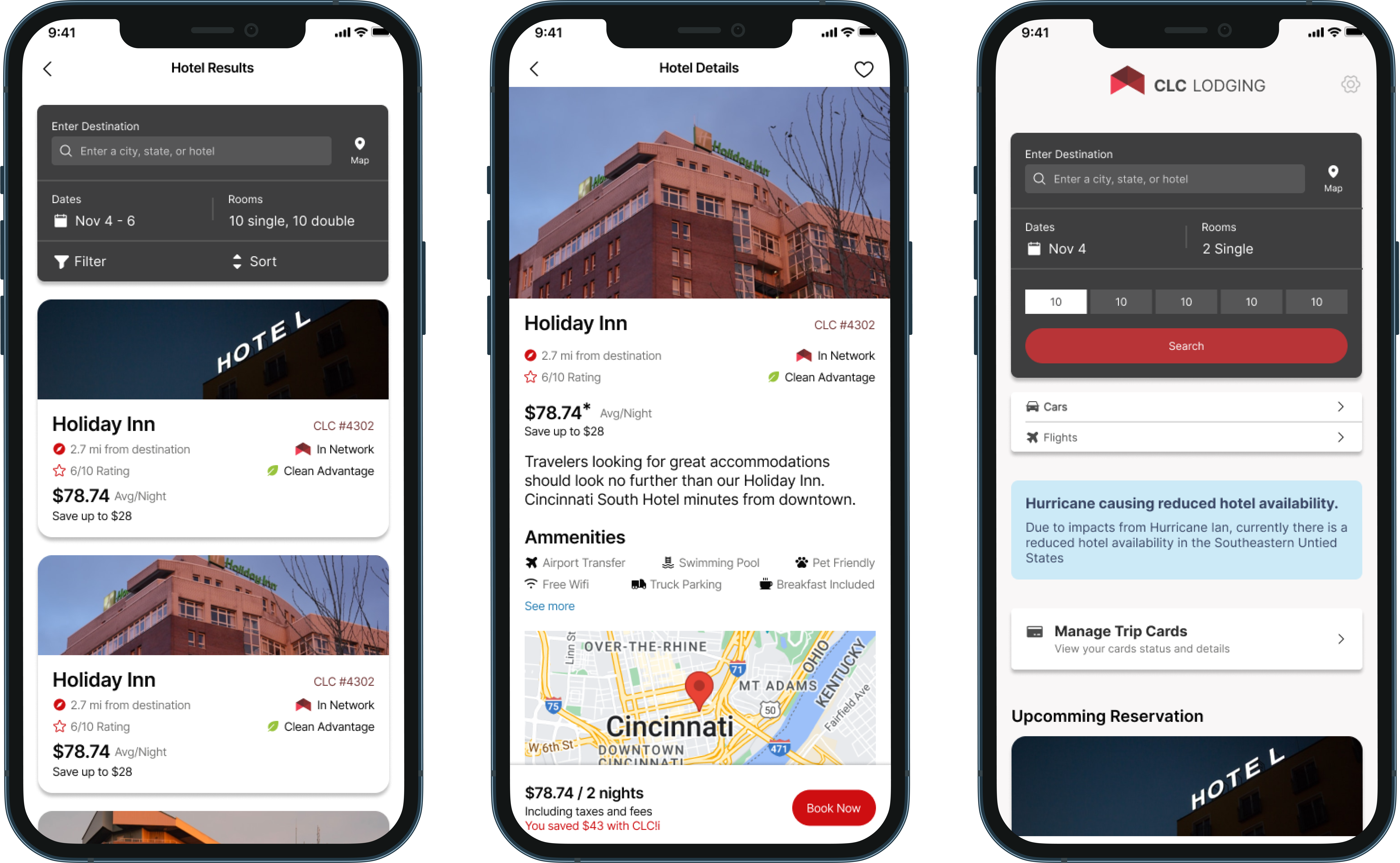
Using these apps in conjunction with my analysis findings, I quickly put together some concept mocks, making sure to focus on spacing, typographical hierarchy and a modern consistency.
Recommendations. I presented the Analysis findings along with the concept mockups based on those finding to the stakeholders of CLC Lodging. Walking through the different heuristics first making sure they understood what I was about to discuss. After spending time on the poor or failing pages, I showed off the concepts mocks.
Talking through the different changes I was proposing I wanted to make sure the client understood why these would be beneficial and an improvement for their app. Showcasing the importance of visual consistency and hierarchy, the client was receptive to my concepts and ultimately wanted to move forward with a full redesign of the app.


Continue Reading
Kroger
Product Designer
Lead product designer for Kroger’s Fresh Departments. I was responsible for a web portal and Android application that helped department leaders and associates better account for production amounts in the bakeries, delis and butchers enterprise wide.